Emote Controller App
Introduction
Video Demonstration
Process
The concept started with analyzing how people process emotions, neurologically to psychologically.
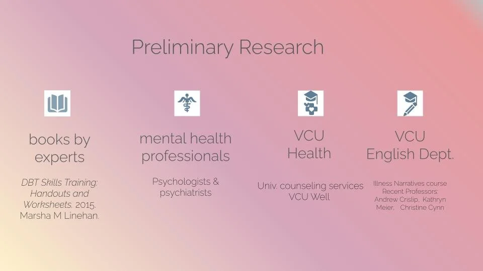
The textual content of the app required information on the topic, acquired through research. This includes resources like books and psychologists, psychiatrists, and university counselors themselves. Once I had the research, I was able to write the textual content of the app.
I looked at competing apps that were similar to mine to compare and contrast.
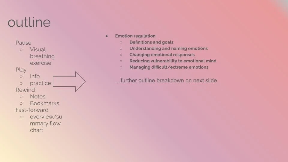
The scope of the app needed to be narrowed down for simplicity. The textual content is broken down through the outline shown.
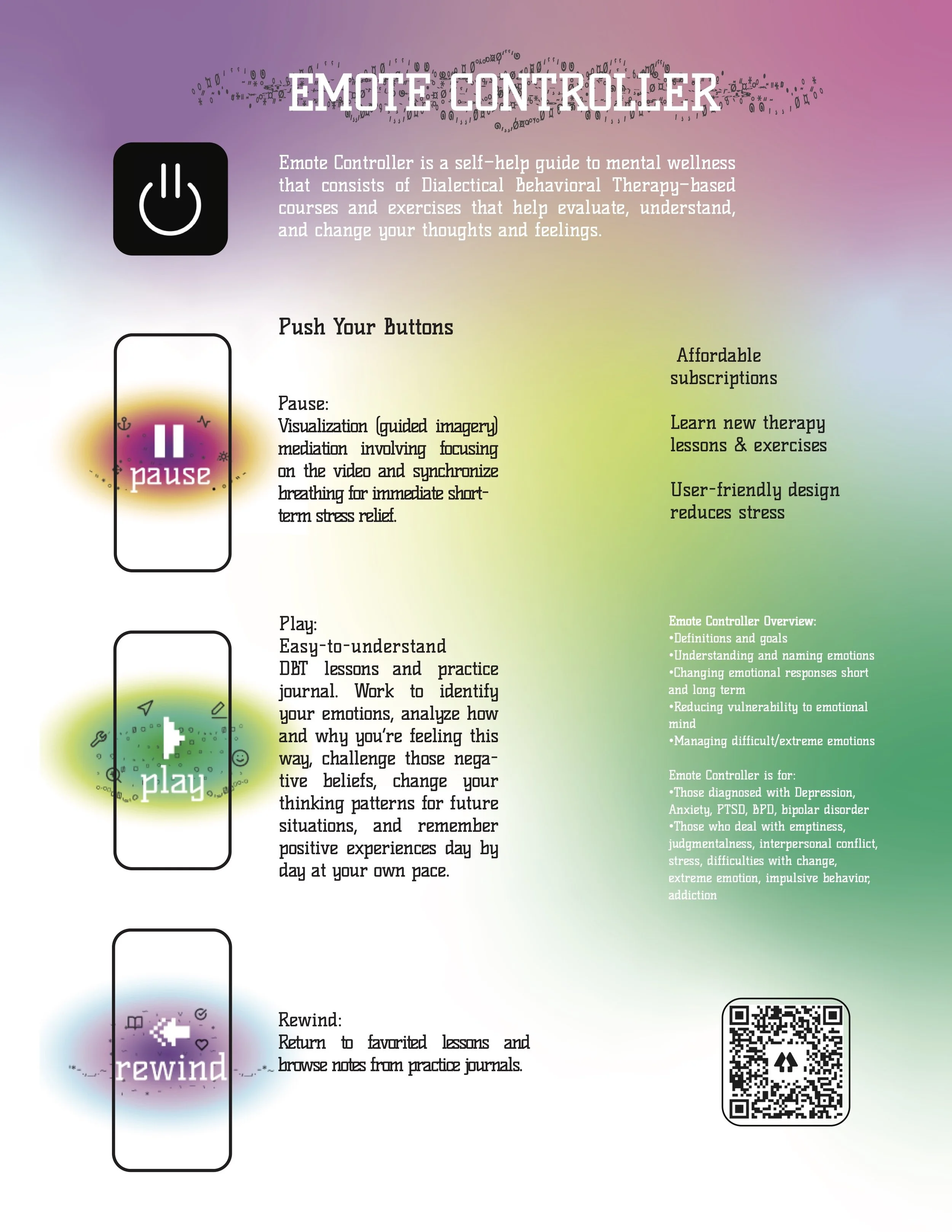
For the design of the information on the app I wanted to have a calming aesthetic but also something that was visually playful.
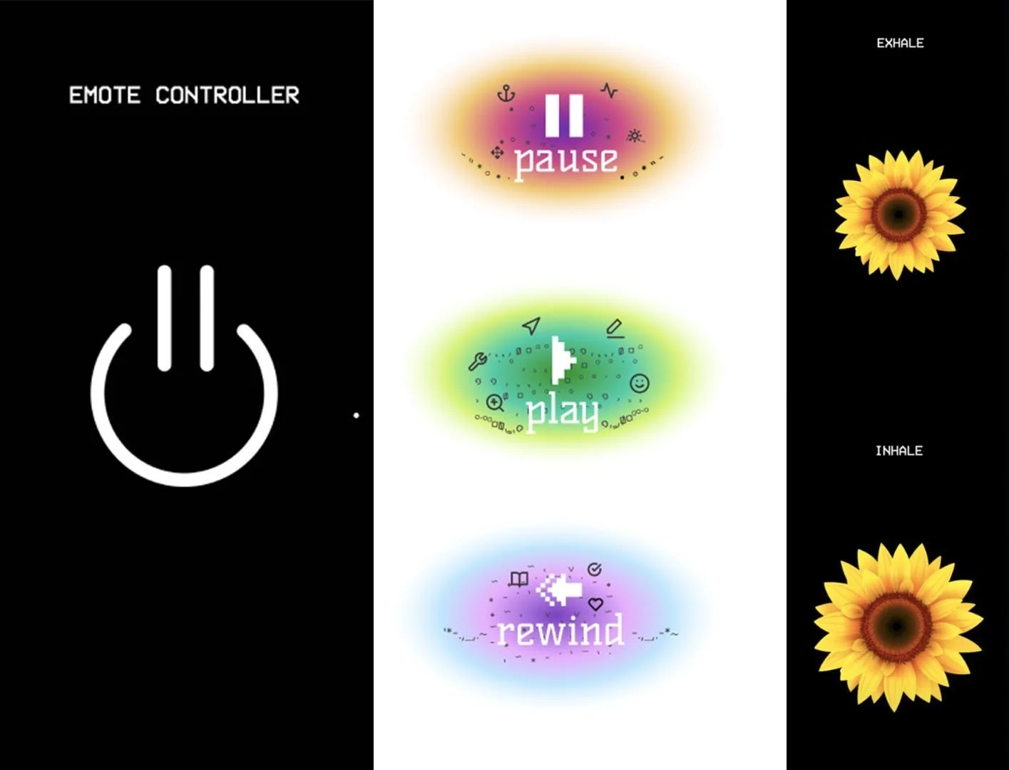
The home screen and main menu were made in illustrator. Then I made the breathing meditation video through Adobe Premiere.
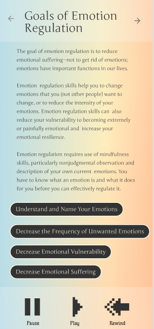
The rest of the project was made in Figma. I created a wireframe based on the outlines I made. Once “pause” is clicked the user is directed to the breathing meditation video, when “play” is clicked the user is directed to the therapy course and so forth. For the background, I made gradients from the colors from photos of sunsets. I then added the menu, buttons, and text in that order.
